Blog / 2025 Color of the Year Award Winners in Interior Paint
2025 Color of the Year Award Winners in Interior Paint
We will discuss the 2025 “Color of the Year” interior paint winners. These hues reflect a shift toward organic, moodier, and sophisticated tones.
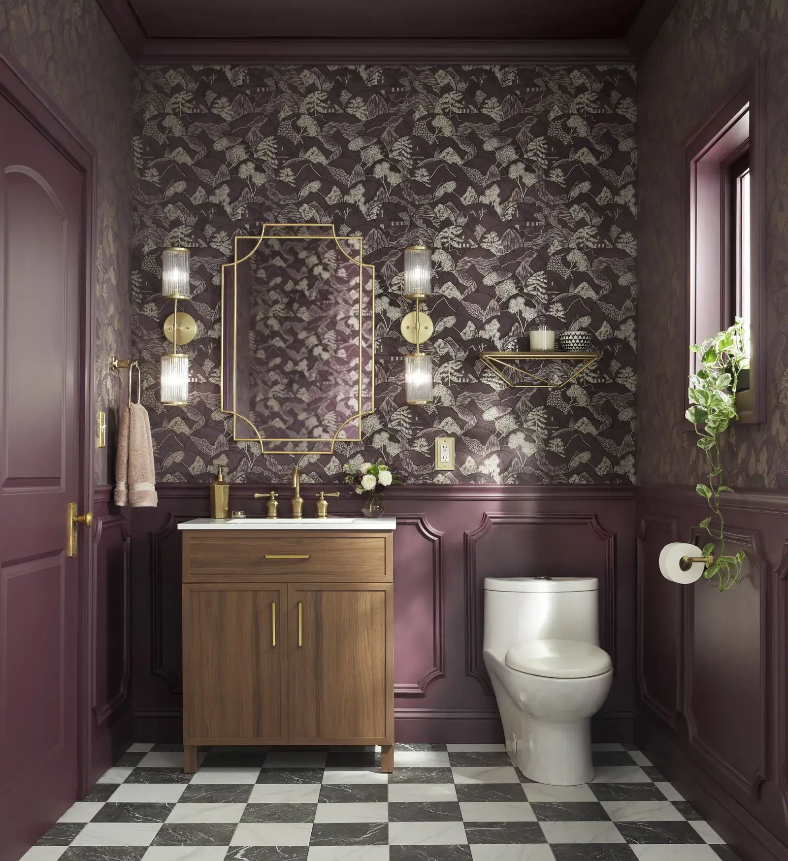
1. Benjamin Moore – Cinnamon Slate 2113‑40
What: A complex blend of plum and velvety brown
How to use it: Ideal for accent walls, moody cabinetry, or a grounded bedroom statement piece.
2. HGTV Home by Sherwin‑Williams – Quietude (HGSW 6212)
What: Soft sage green with a calming blue hint
Why it stands out: Represents simplicity and “slower living,” ideal for nurseries, entryways, or spa-like bathrooms. Layer with creams and warm woods to evoke a serene, spa ambience.
3. PPG/Glidden – Purple Basil
What: Jewel‑toned, deep violet
Why it’s bold: Reflects homeowners’ increased confidence in bold colors; adaptable. Opulent tradition or modern chic depending on light. Stunning on accent walls, dramatic dining rooms, or lush exteriors.
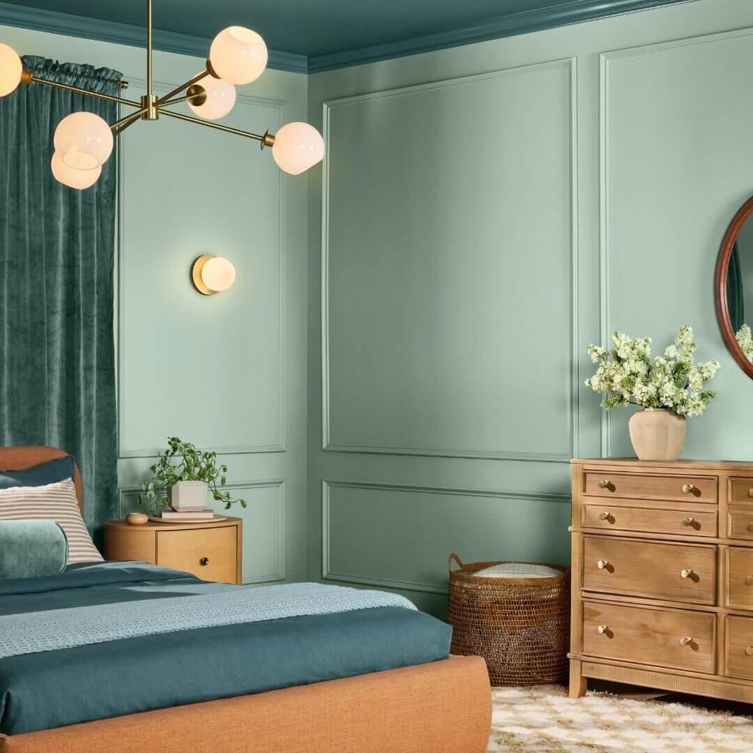
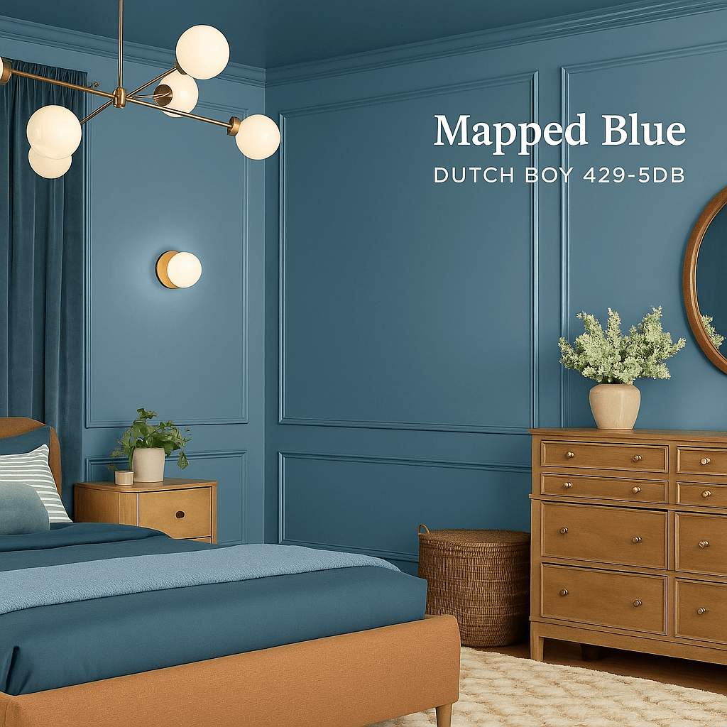
4. Dutch Boy – Mapped Blue (429‑5DB)
What: Medium-tone blue-gray with soft warmth
Why it wins: Timeless foundation that adapts with evolving styles. A serene wall cover, kitchen island focal point, or calming ceiling hue.
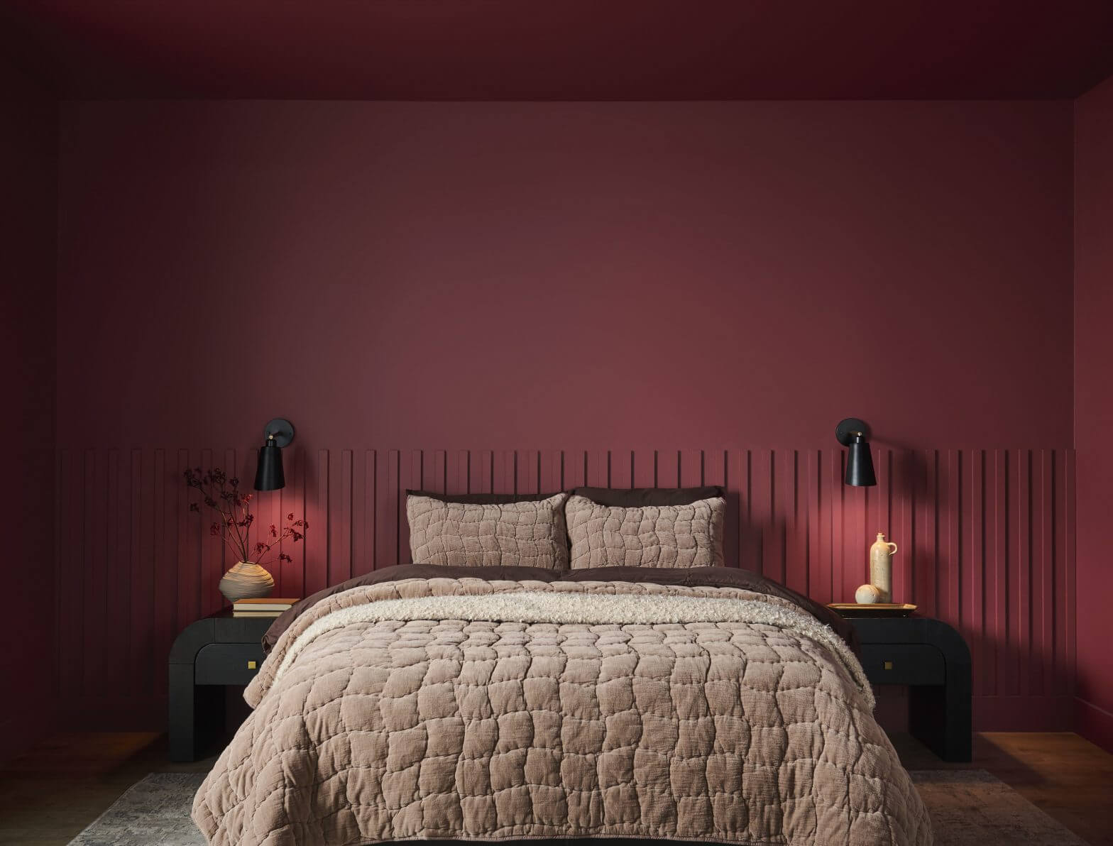
5. Behr – Rumors (MQ1‑15)
What: Deep, luxurious ruby red
Why it’s luxe: A refined shade of red—on-trend and dramatic, exuding warmth and allure. Apply as accent walls or used on statement furniture for intensity with control.
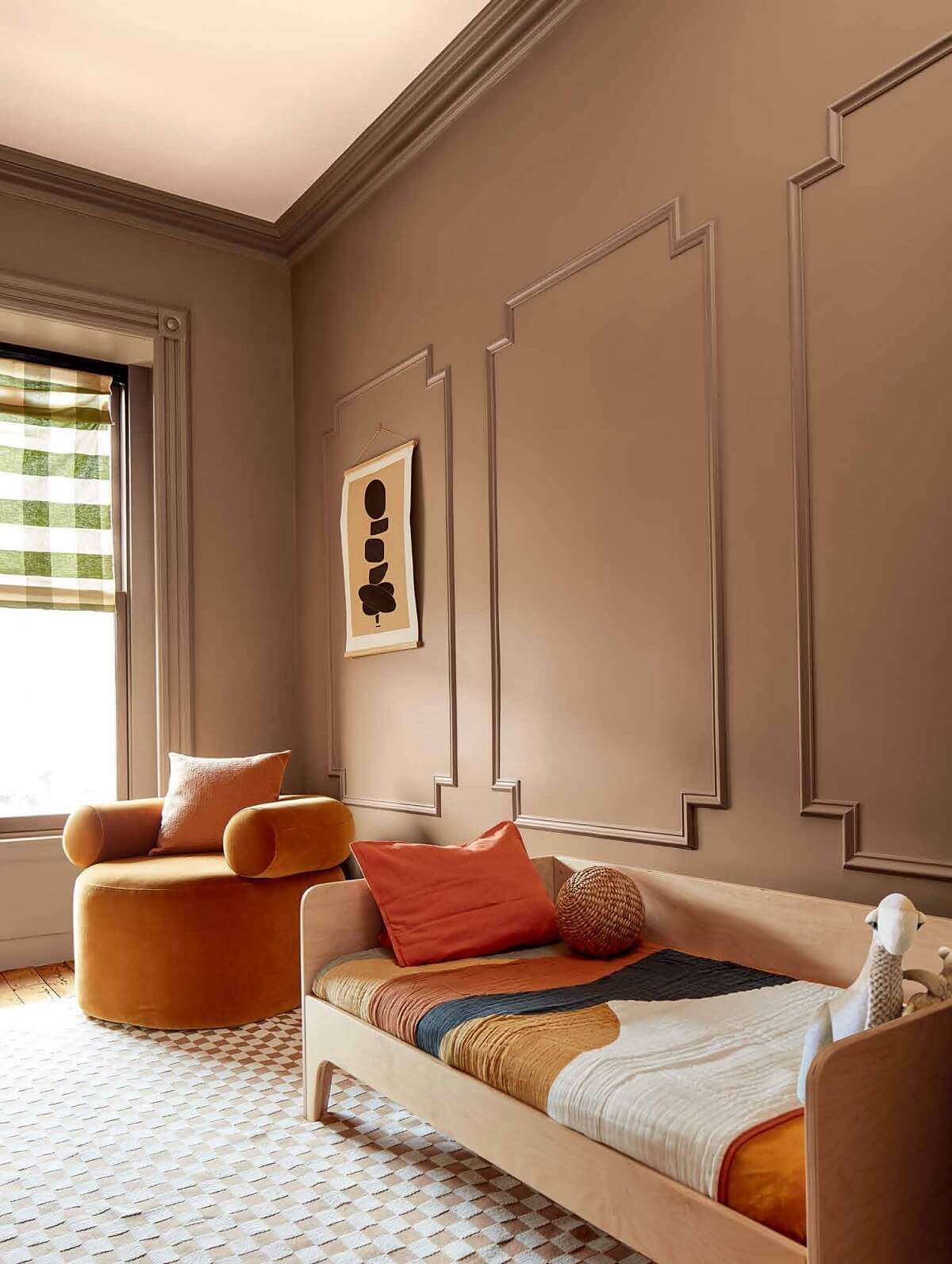
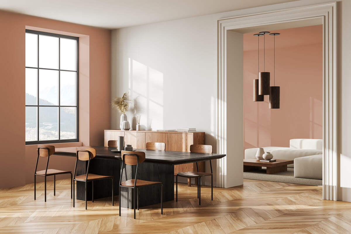
6. Dunn‑Edwards – Caramelized (DET687)
What: Earthy terracotta brown
Why it shines: A versatile “new neutral” offering vintage charm and modern elegance. Cozy living rooms, minimalist kitchens, and outdoor furniture accents.
How to Feature These in Your Home
Identify the goal: bold accent? Calm sanctuary? Choose the hue that matches your intention.
Test first: Paint samples in different light—day, evening, and artificial illumination. You can even try using AI renderings to get a feel of the paint on your wall.
Balance thoughtfully: Pair bold shades (e.g., Purple Basil, Rumors) with neutrals or textural elements like wood and stone.
Play with placement: Accent walls, ceilings, or built-ins can electrify spaces without overwhelming them.
State Restoration’s design team can help you select colors for your space that match the materials you select and the vibe you are going for. Visit our showroom to see some examples and disucss your project.